Apple recently made an announcement that it will launch its 5th generation iPad around March 2013 with a new screen size. Is your company's website going to look good on the new device?
August 16, 2014
Nickspages.com, Inc. has mastered the art of responsive design by creating width parameters to target every device ahead of time. With a little CSS, your existing website can look perfect on every device.
Current Widths Used
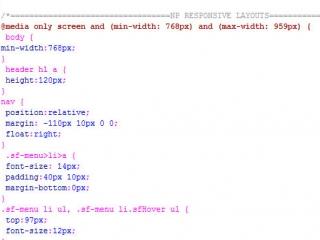
iPad Sized Screens Including Android: (min-width: 768px) and (max-width: 959px)
iPad Mini Sized Screens Including Android: (min-width: 480px) and (max-width: 767px)
iPhone Sized Screens Including Android: (max-width: 479px)
NP will not only code for the new screen size, but it will also be sure to test the mobile versions of all current clients the day the device is on display.